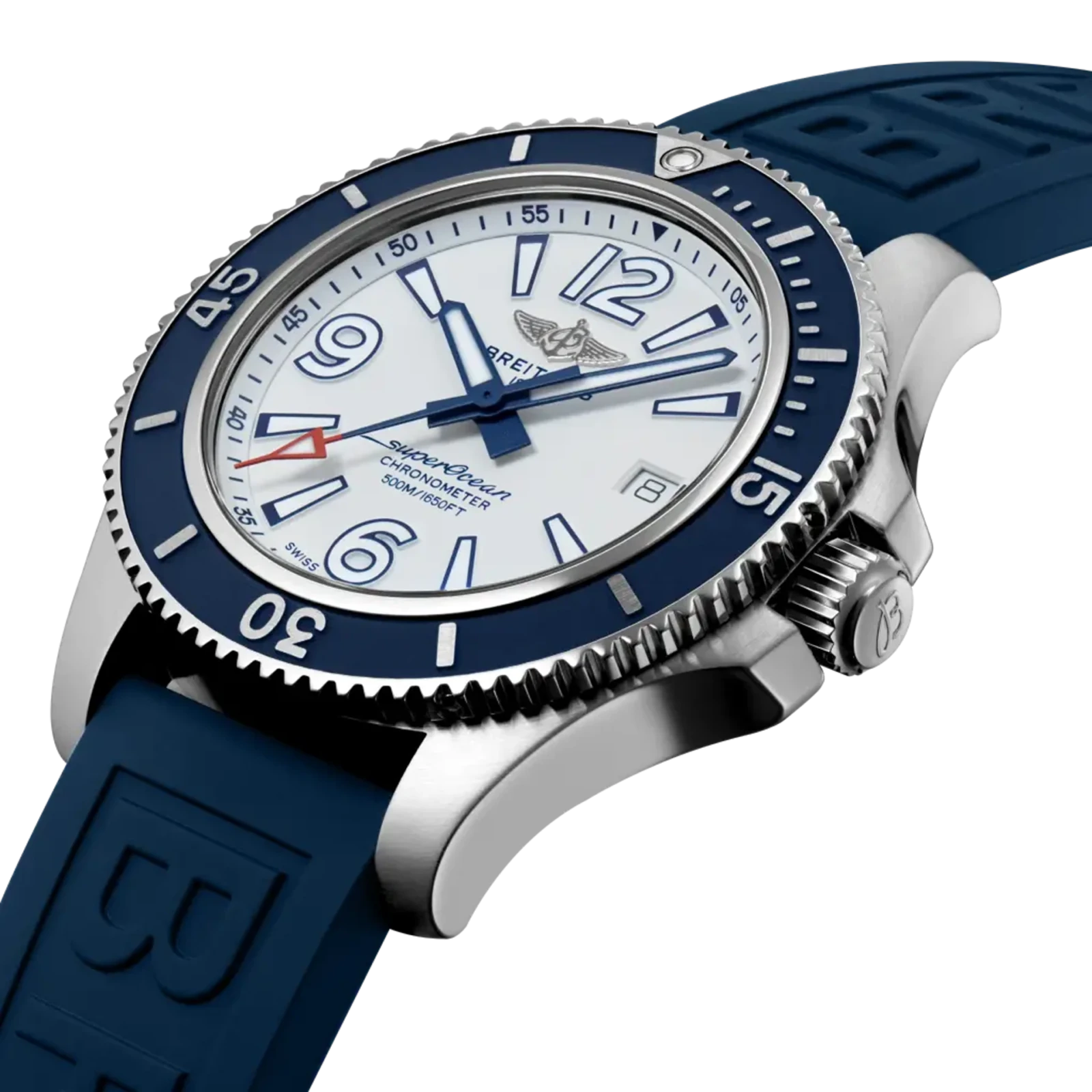
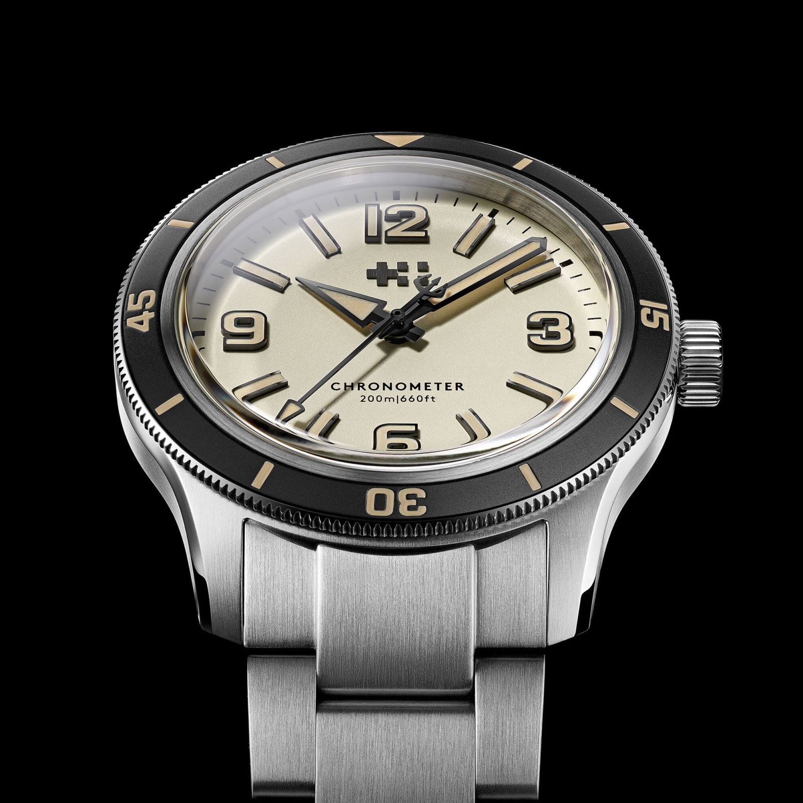
When Christopher Ward unveiled the new C60 Trident Biscay, much of the immediate conversation went where watch conversations usually go: Tudor, the Black Bay and the crowded market for vintage-styled divers. But put the cream-dial Biscay Automatic beside the previous-generation Breitling Superocean Automatic 42—the A17366 introduced in 2019 and replaced in 2022—and a more interesting comparison appears.
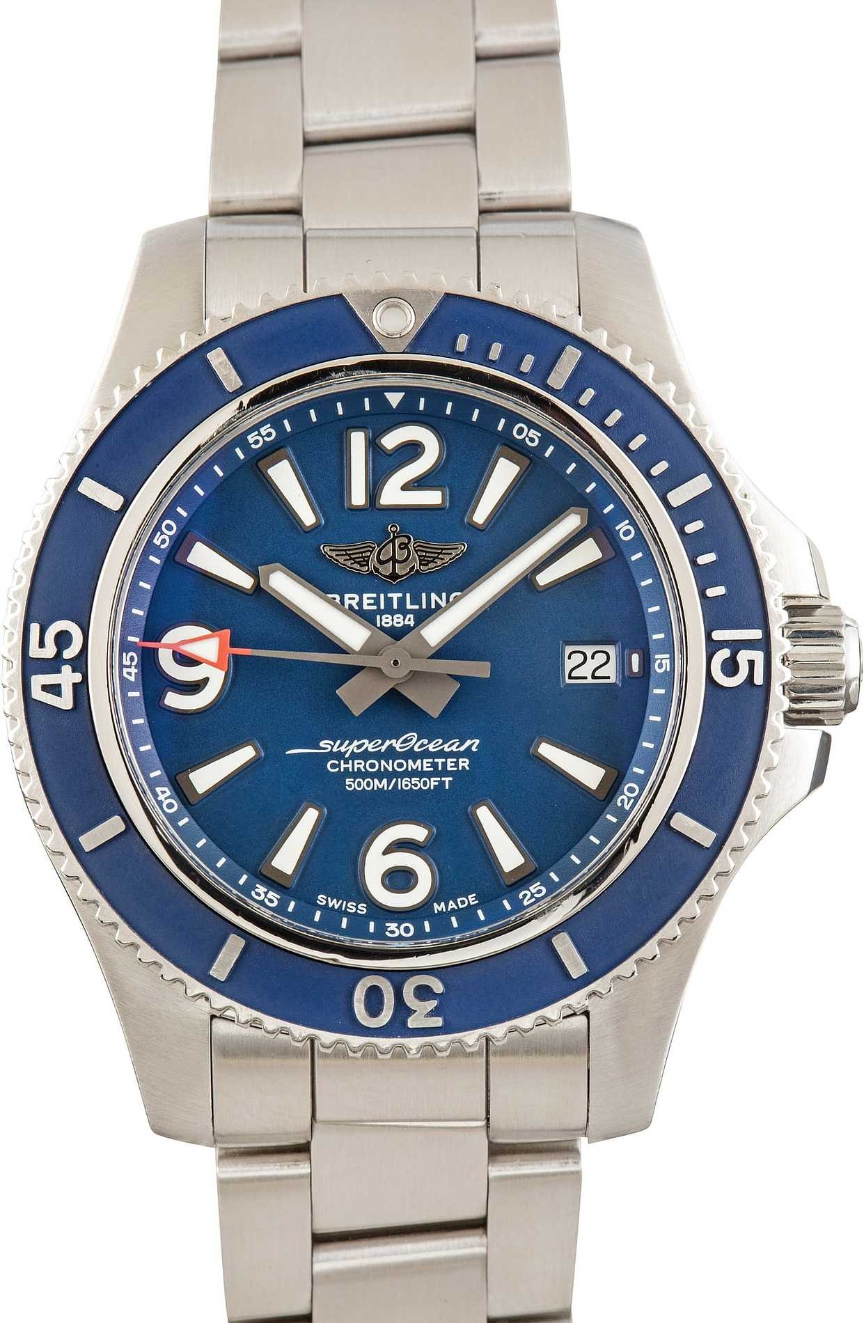
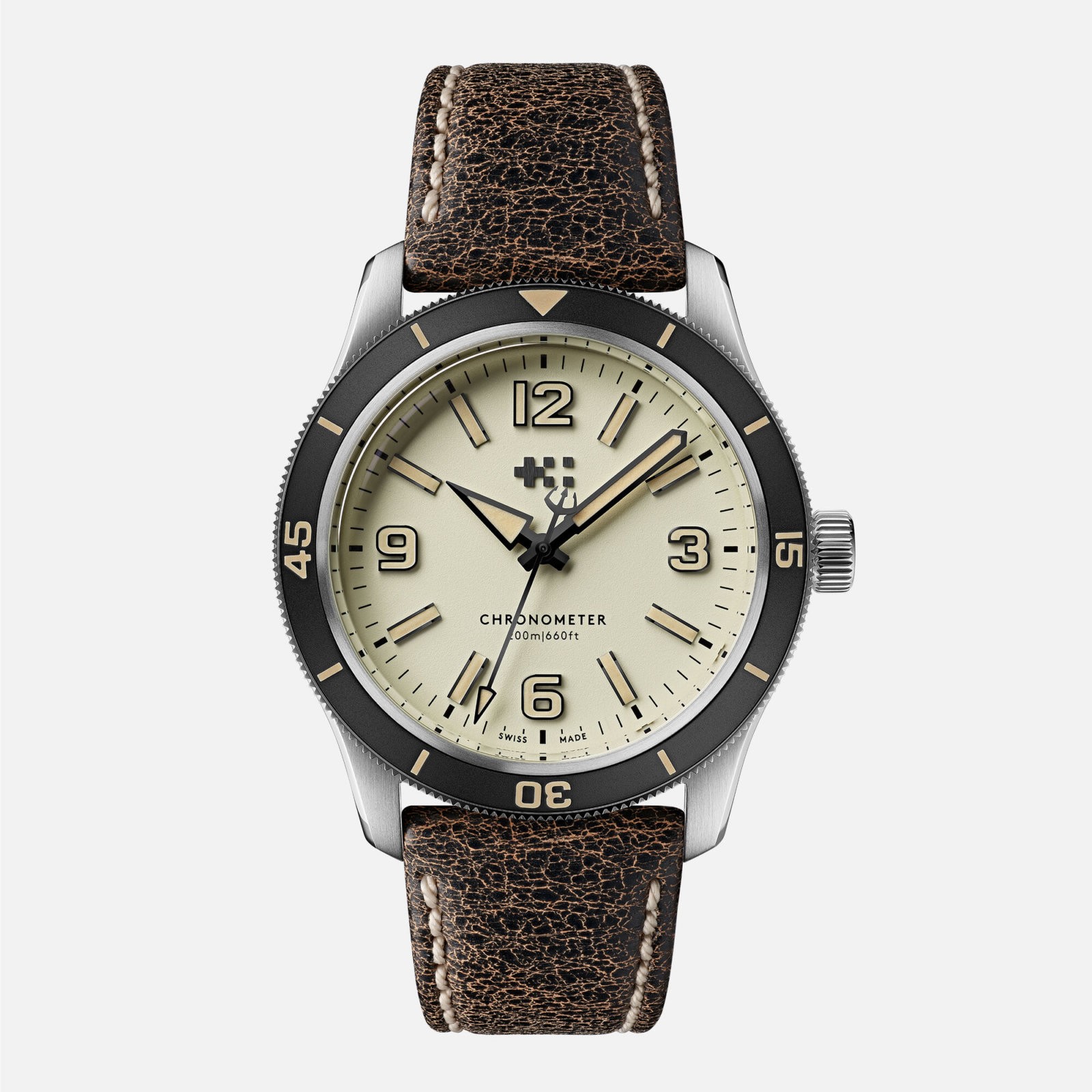
The resemblance is not based on one copied component. The cases are different. The bezels are different. The handsets are different. Christopher Ward uses four large Arabic numerals at 12, 3, 6 and 9; the Breitling gives three of those positions to numerals and uses the fourth for its date. It is the whole face that feels familiar: oversized cardinal numerals, alternating luminous batons, broad hands, a clean minute track and almost the same sparse bezel grammar—a triangle and pip at 12, large 15, 30 and 45 numerals, and simple bars between them. Both are bold without becoming cluttered. Both look like instruments, but not anonymous ones. At a glance, the Biscay resembles what might have happened if someone had taken the A17366, removed the date and a couple of millimetres of thickness, and sent the result through Christopher Ward’s contemporary industrial-design studio. That is not the same thing as calling it a Breitling homage. Christopher Ward says the Biscay draws from 1960s skin divers and describes its blocky numeral font as inspired by vintage Longines. The A17366 was a very different object: a 42mm, 13.32mm-thick, 500-metre professional diver with Breitling’s Calibre 17 and a distinctly modern brief. The new Biscay is a roughly 11mm-thick, 200-metre skin diver offered in 39mm and 42mm. Nobody would confuse the two in profile or on a specification sheet. The point is not that Christopher Ward copied Breitling. It is that Christopher Ward has walked confidently into visual territory Breitling chose to vacate.
Breitling already had its Porsche 911
The A17366 was not perfect. Its 500-metre rating came with some thickness, its Breitling 17 offered only about 38 hours of power reserve, and its date window occupied the one cardinal position the dial seemed to want back. There was plenty to improve.
But there was also plenty to preserve.
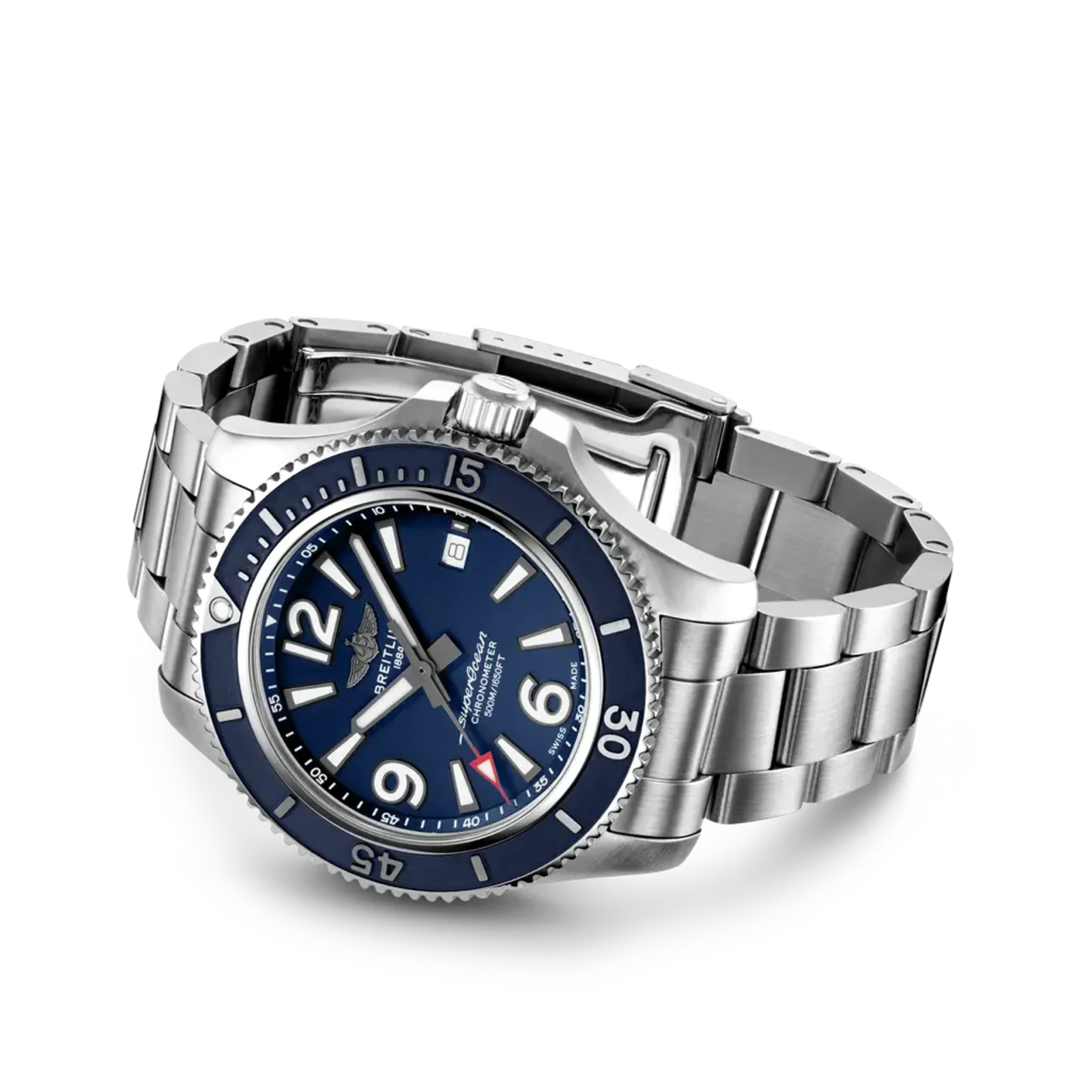
And the A17366 was not a three-year design experiment. It was the cleanest late expression of a modern Superocean branch that had been evolving since the Colt SuperOcean A17040 and A17340 appeared in 1995. The cases, hands and depth ratings changed over the following 27 years, but the family repeatedly returned to the same grammar: prominent Arabic numerals, luminous batons, a date at three, an emphatic bezel and a deliberately overbuilt case. The A17366 did not invent that identity. It distilled it.
The large 12–9–6 dial, the deeply toothed bezel, the muscular case and the slightly theatrical level of overengineering made it instantly recognizable as a Breitling. It shared a broader design vocabulary with the Colt and Avenger without becoming interchangeable with either. From across a room, it did not look like a Submariner wearing a different logo.
 That was the opportunity.
Breitling could have treated this generation of Superocean the way Rolex treats the Submariner or Porsche treats the 911: not as a finished design to preserve in amber, but as a durable form to keep refining. Make it thinner. Improve the bracelet and clasp. Modernize the bezel. Give it a better movement. Tighten the typography. Keep the face.
That was the opportunity.
Breitling could have treated this generation of Superocean the way Rolex treats the Submariner or Porsche treats the 911: not as a finished design to preserve in amber, but as a durable form to keep refining. Make it thinner. Improve the bracelet and clasp. Modernize the bezel. Give it a better movement. Tighten the typography. Keep the face.
 An icon is not created by refusing to change. The 911 has changed almost everywhere over six decades. What Porsche protects is the grammar: the roofline, the stance, the rear-engined proportions and the sense that every new one belongs to the same continuing object. Rolex applies the same discipline to the Submariner. You can argue about individual generations, but you never have to ask what they are.
Breitling had the raw material for that kind of continuity. The A17366 was already a clean, modern expression of it. Then, after roughly three years, Breitling replaced it with an entirely different Superocean.
The next move had been sitting in plain sight. In a 2021 review, Beyond the Dial made the obvious enthusiast request: lose the date and put a large “3” in its place.
An icon is not created by refusing to change. The 911 has changed almost everywhere over six decades. What Porsche protects is the grammar: the roofline, the stance, the rear-engined proportions and the sense that every new one belongs to the same continuing object. Rolex applies the same discipline to the Submariner. You can argue about individual generations, but you never have to ask what they are.
Breitling had the raw material for that kind of continuity. The A17366 was already a clean, modern expression of it. Then, after roughly three years, Breitling replaced it with an entirely different Superocean.
The next move had been sitting in plain sight. In a 2021 review, Beyond the Dial made the obvious enthusiast request: lose the date and put a large “3” in its place.
 Five years later, Christopher Ward has effectively built that dial.
The current Superocean is good—but it starts over
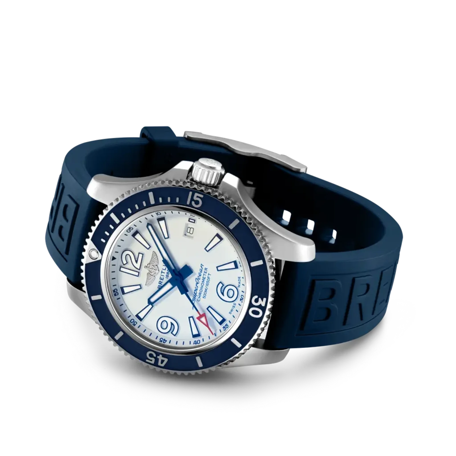
I like the current Superocean. It is colourful, legible and far more distinctive than most modern dive watches. Its square-ended minute hand and high-contrast dial ring give it real identity. But that identity comes from somewhere else. The current watch, introduced in 2022, retraces the design codes of Breitling’s 1960s “Slow Motion” Superocean ref. 2005. The original was a genuinely unusual diving chronograph. Instead of a conventional chronograph seconds hand, its central chronograph hand completed one revolution per hour so a diver could read elapsed minutes directly. Because that hand moved too slowly to show whether the chronograph was running, Breitling added an activity indicator above six o’clock. That was not decoration. The strange dial existed because the watch did something strange. The modern Superocean borrows the Slow Motion’s visual signatures but is a conventional three-hand watch. It has no chronograph and no functional activity indicator. That does not make it inauthentic; archival designs are reinterpreted all the time, and the result is attractive. But Breitling revived the face, not the idea. It is the look of a historical mechanism without the mechanism—and not an evolution of the Superocean Breitling had been selling immediately beforehand. Breitling reached backwards, past a coherent modern design language it already owned, and restarted the line around an archival chronograph—without the chronograph.
Christopher Ward understands the product opportunity
On specifications alone, the Biscay is not trying to reproduce the A17366’s professional capability. It is doing something commercially smarter. The time-only model comes in 39mm and 42mm cases measuring 11.0mm and 11.4mm thick, respectively. It offers 200 metres of water resistance, a box sapphire crystal, a hardened aluminium bezel and a COSC-certified Sellita SW300-1 with a 56-hour power reserve. It is a true no-date movement, not a date calibre hiding a phantom crown position. Automatic, GMT and bronze versions arrived together, giving Christopher Ward a small family rather than a one-off design exercise. The Biscay Automatic starts at £1,330 or US$1,870 on a strap and US$2,095 on its three-link bracelet. A current steel Breitling Superocean Automatic 42 is listed at US$5,700 on rubber and US$5,900 on bracelet, with 300 metres of water resistance and a COSC-certified Breitling 17 offering approximately 38 hours of power reserve.
 That does not make the watches equivalent. Breitling brings a global retail and service network, substantially greater brand equity, and details that cannot be judged from a press photograph. I have not handled the Biscay, so this is a design argument, not a declaration that its tactile quality equals Breitling’s.
But Christopher Ward does not need to equal Breitling in every respect to eat into the opportunity Breitling left behind. It only needs to offer a convincing, recognizable and well-specified dive watch at roughly a third of the price. For buyers who loved the visual confidence of the previous Superocean but wanted it thinner, cleaner and without the nearly US$6,000 entry ticket, the Biscay now occupies an inviting piece of empty ground.
That is how a smaller company starts eating a larger brand’s lunch. It does not have to convert committed Breitling buyers. It catches some of them before they become committed Breitling buyers at all.
And Christopher Ward can keep iterating on it. That is the important part.
That does not make the watches equivalent. Breitling brings a global retail and service network, substantially greater brand equity, and details that cannot be judged from a press photograph. I have not handled the Biscay, so this is a design argument, not a declaration that its tactile quality equals Breitling’s.
But Christopher Ward does not need to equal Breitling in every respect to eat into the opportunity Breitling left behind. It only needs to offer a convincing, recognizable and well-specified dive watch at roughly a third of the price. For buyers who loved the visual confidence of the previous Superocean but wanted it thinner, cleaner and without the nearly US$6,000 entry ticket, the Biscay now occupies an inviting piece of empty ground.
That is how a smaller company starts eating a larger brand’s lunch. It does not have to convert committed Breitling buyers. It catches some of them before they become committed Breitling buyers at all.
And Christopher Ward can keep iterating on it. That is the important part.
Identity is only valuable if you keep it
I am not asking Breitling to remake the A17366 exactly. A faithful reissue would miss the lesson. That watch should have been the starting point, not the destination.
The missed opportunity was to decide that its dial architecture, bezel hardware and unapologetically overbuilt character were the modern Superocean—and then improve that object over successive generations. Breitling already knows how to maintain a separate Superocean Heritage family. It could have kept its archival revivals there, or brought back the Slow Motion as the chronograph it actually was, without resetting the core line. What it did not need to do was sacrifice one identity to borrow another.
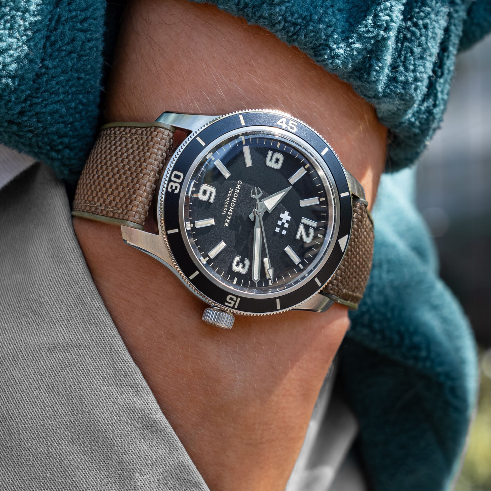
Christopher Ward has looked across an impossibly crowded dive-watch market and arrived at a face that feels clean, legible and immediately familiar. Its official inspiration may lie in the 1960s, but the finished watch also reveals how much life remained in the Superocean Breitling discontinued only four years ago.
 Breitling did not lose that design to Christopher Ward. It left the design unattended.
In watches, abandoned identity is still available real estate.
Breitling did not lose that design to Christopher Ward. It left the design unattended.
In watches, abandoned identity is still available real estate.
Sources and further reading
- Christopher Ward: C60 Trident Biscay collection
- Christopher Ward: pictured Sand/Black Biscay Automatic
- Christopher Ward: “Storm warning” — the Biscay design story
- Breitling: the history of the Superocean and Slow Motion
- Breitling: current Superocean Automatic 42 specifications
- Breitling: archived blue A17366D81C1A1 specifications
- Breitling: current Superocean Automatic 42 on bracelet